Winged words
Winged words
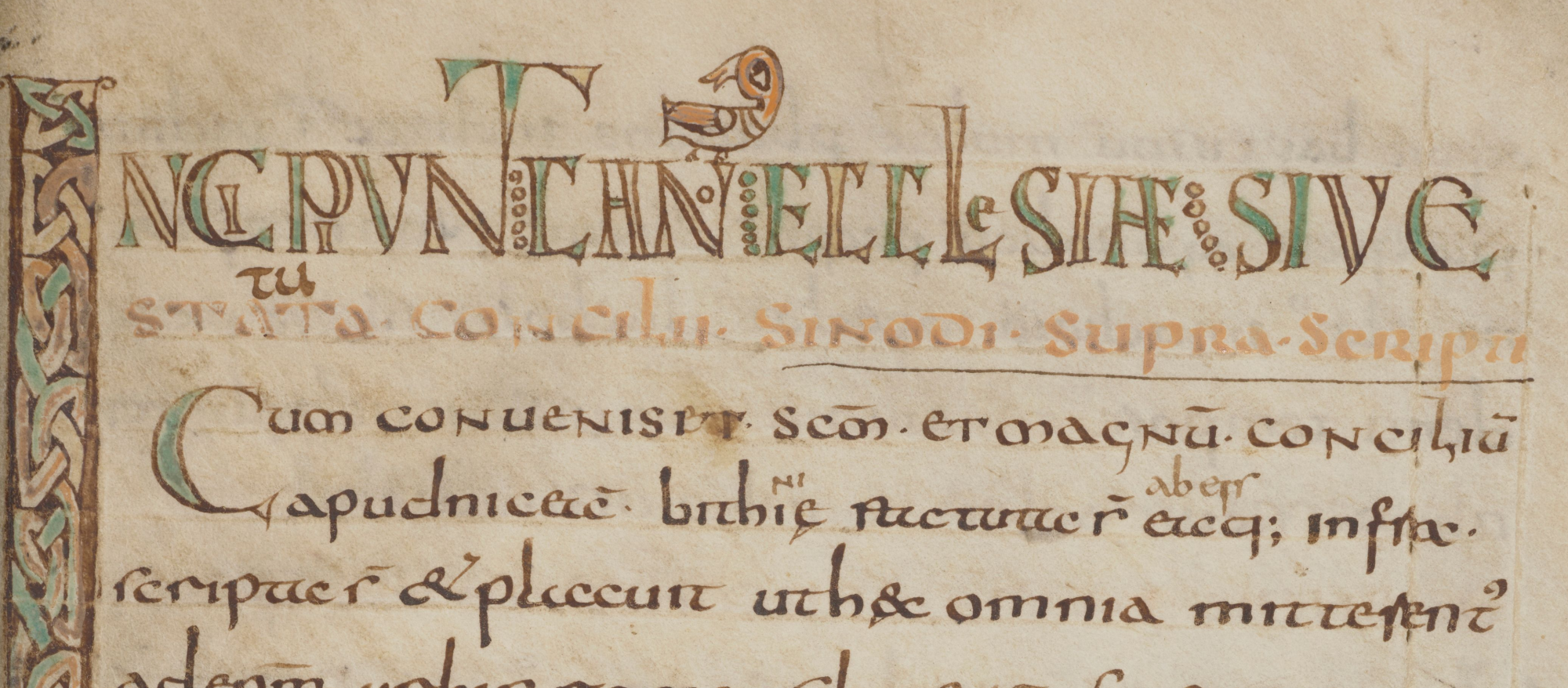
The illustrator of the eighth-century manuscript MMW 10 B 4 in Huis van het boek had a special liking for winged animals. Birds have parked themselves on letters in headings, or sit jauntily on an initial decorated with interlaced knotwork. On folio 131r, a chicken bravely defends itself against a fox. Even the abbreviation marks above the colourful headings take the shape of wings. It is as if the words can fly away any moment now.

Huis van het boek, MMW, 10 B 4, fol. 143r (detail)
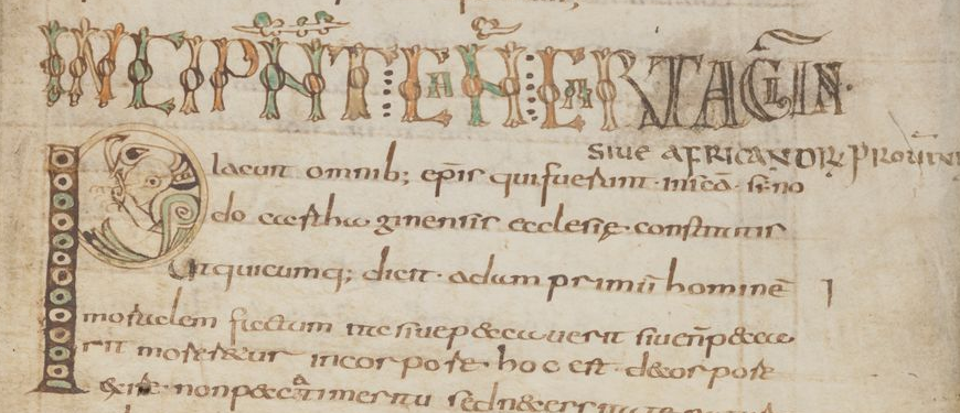
Huis van het boek, MMW 10 B 4, fol. 95r (detail)
Manuscript MMW 10 B 4 is a collection of canon law texts: decisions from ecumenical councils of the first centuries AD to local councils in fifth- and sixth-century Gaul. For such a serious collection of canon law texts, the decorations are remarkably playful.
The manuscript was produced in France, probably in Bourges. The style of decoration is very similar to that of insular manuscripts, especially the intricate interlace design and fantastic animals. This is not at all unusual for Frankish manuscripts of this period. In fact, these decorative features that we tend to associate with insular manuscripts were widespread across Northern Europe (Emilia Henderson 2020)
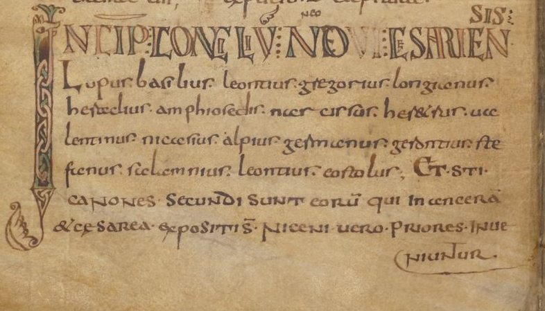
Huis van het boek, MMW 10 B 4, f. 62v (detail)
Another similarity with insular manuscripts is the playful treatment of letters. The headings consist of colourful letters in red, yellow and green, with some letters in tiny script placed within larger letters. A reader needs to fit the letters together as pieces of a puzzle to create words and meaning. The scribe, who was probably the same person as the illustrator, occasionally struggled to figure it out himself. Here and there, a later hand has written the solution of an incomprehensible puzzle word above the inscription. Sometimes a letter is missing and cannot be found, not even after a long search. On folio 168r, birds come flying in to drop the missing letter (a ‘u’ in the shape of a chalice) into the heading – almost at the right place.
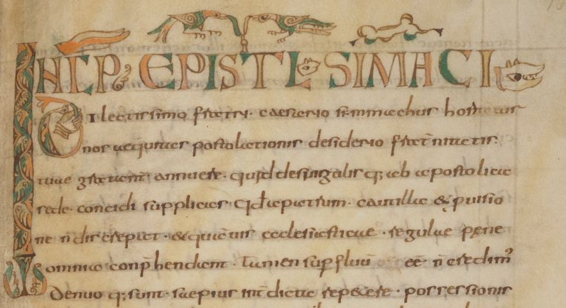
Huis van het boek, MMW 10 B 4, f. 168r (detail)
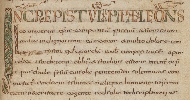
Huis van het boek, MMW 10 B 4, fol. 163r (detail). Please note the bird in the initial L below the heading
The illustrator not only had a special liking for wings, but also for hands. In the image above, we detect a hand in the initial under the inscription, holding the curved shaft of an uncial D. The winged abbreviation line above ‘Incipit’ also resembles a hand. This is even clearer in the opposite image where the abbreviation mark above Pope Leo’s name closely resembles a blessing hand. The resemblance becomes even more apparent when compared to the remarkably large hands of the priest blessing the wine and hosts in the full-page drawing at the beginning of the book.
Letters incorporating hands are a common feature of Frankish manuscripts of this period (Kitzinger 2021) and can also be found in Byzantine manuscripts (Brubaker, 1991). These hands remind us how closely books were connected to the body, and to actions performed while reading aloud. Such a performance of the text was not necessarily liturgical. The hands of the reader could also bring the text to life in other ways, as we can read in Malou Moen’s blog ‘A defrosted manuscript’.
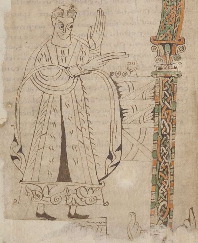
Huis van het boek, MMW 10 B 4, fol. 1v (detail). Elements of this drawing closely resemble features of the decorated headings. It seems therefore unlikely that the drawing was added later, as E. A. Lowe suggested.
Emilia Henderson, Early medieval interlace – a distinctive or ubiquitous feature?, 6 October 2020, https://blogs.bl.uk/digitisedmanuscripts/2020/10/early-medieval-interlace.html
Beatrice Kitzinger, ‘Wandalgarius’ letters of the law: figural initials and book culture in the late eighth century’, Zeitschrift für Kunstgeschichte 84 (2021), pp. 291-324
E.A. Lowe, Codices latini antiquiores: a palaeographical guide to Latin manuscripts prior to the ninth century, 10 (Oxford, 1963), p. 39


